Learning Color Management: COSOURCE’s G7 Training and Printing Factory Visit
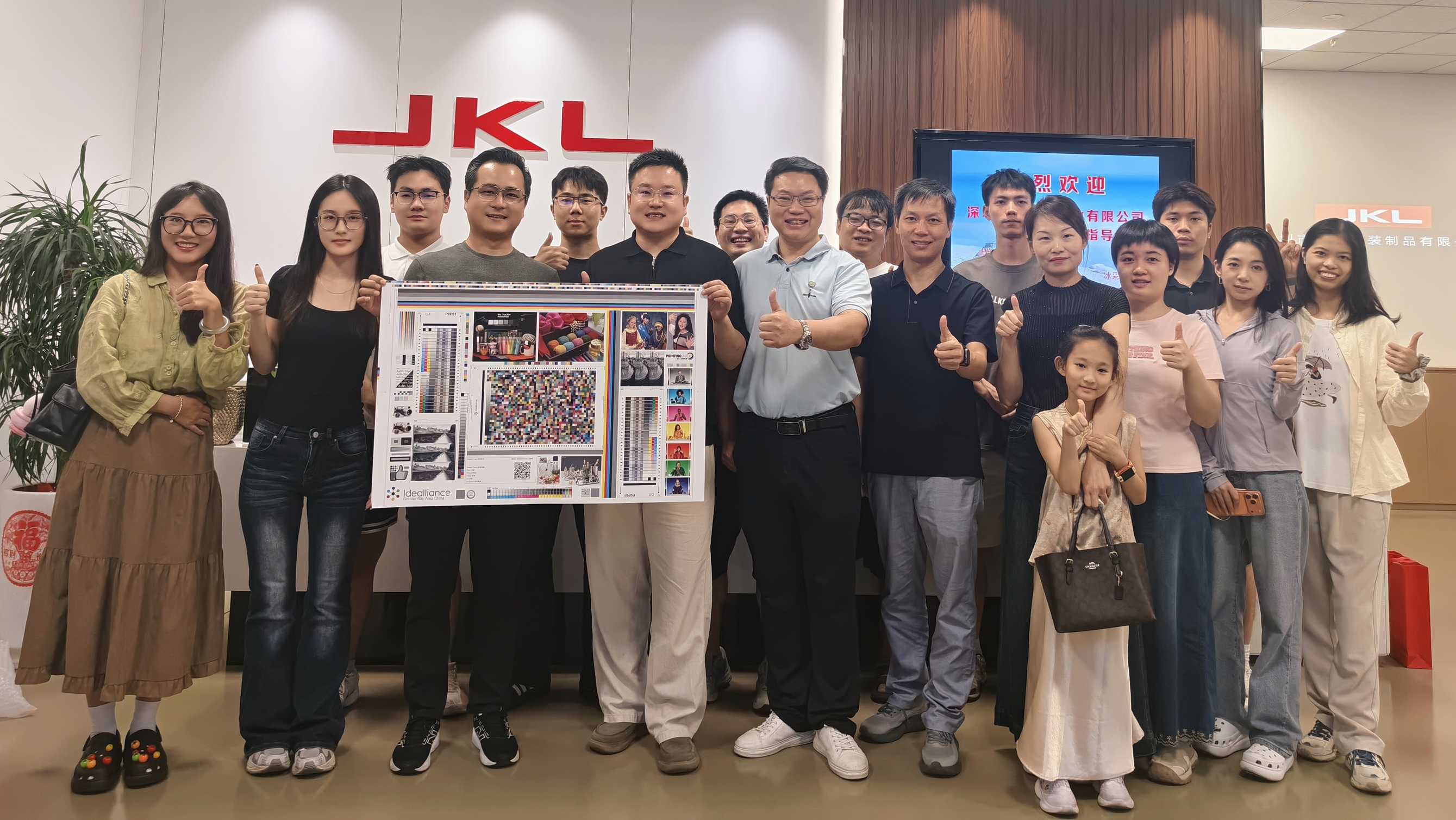
In the luxury packaging industry, brand colors represent identity, market trust, and consumer loyalty. However, reproducing precise brand hues across different substrates, finishing coatings, and multiple production runs is one of the most demanding challenges in packaging manufacturing. To eliminate visual variance and uphold world-class printing standards, the Cannasafepack team recently completed an extensive G7 color management training program, combining advanced classroom methodology with real-world offset press calibrations.
- 1. Why G7 Color Management Matters for Premium Packaging
- 2. Phase 1: Mastering G7 Calibration Theory in the Classroom
- 3. Phase 2: On-Site Printing Factory Audit and CTP Pre-Press Inspection
- 4. Phase 3: Press Sheet Analysis and Hands-On Spectrophotometry
- 5. Tangible Benefits: What G7 Mastery Means for Your Brand
1. Why G7 Color Management Matters for Premium Packaging
Traditional offset printing relied heavily on individual press operator intuition, ambient lighting conditions, and traditional Solid Ink Density (SID) measurements. While density control ensures proper ink film thickness, it fails to account for human visual perception and the critical balance of neutral grays. A variance in paper stock absorbance or fountain solution balance can result in noticeable color shifts between separate production runs.
Developed by Idealliance, the G7 methodology fundamentally redefined color control by shifting the focus from mechanical TVI (Tone Value Increase) to optical NPDC (Neutral Print Density Curves). By calibrating cyan, magenta, and yellow (CMY) to replicate identical neutral gray curves against pure black, G7 achieves a shared visual appearance across any print process, regardless of paper type or ink set.
2. Phase 1: Mastering G7 Calibration Theory in the Classroom
Our training program began with comprehensive classroom seminars led by senior color management specialists. Our engineering, quality control, and pre-press teams conducted in-depth studies of ISO 12647 standards, CIE L*a*b* color spaces, and digital curve linearization algorithms.

Key modules covered during the technical training sessions included:
Neutral Print Density Curves (NPDC): Understanding how human eyes perceive mid-tone gray balance (50C, 40M, 40Y) compared to single-color black channels.
Highlight Contrast (HC) and Highlight Range (HR): Standardizing tonal balance in critical highlight areas to prevent packaging graphics from looking washed out or muddy.
Delta E Tolerances (ΔE00 < 2.0): Defining strict mathematical acceptance boundaries for brand corporate colors to eliminate subjective disputes.
3. Phase 2: On-Site Printing Factory Audit and CTP Pre-Press Inspection
Color accuracy begins well before paper reaches the offset printing press. To bridge theoretical science with real-world manufacturing, our team relocated to the printing facility floor to inspect pre-press plate imaging and chemical processing parameters.

At the Computer-to-Plate (CTP) workstations, we audited laser dot formation, thermal plate sensitivity, and developer bath maintenance schedules. Verifying that the 1% to 99% tonal scale transfers accurately onto the aluminum plates ensures that the RIP (Raster Image Processor) calibration curves are faithfully maintained without distortion during ink transfer.
4. Phase 3: Press Sheet Analysis and Hands-On Spectrophotometry
The pinnacle of our G7 calibration workflow occurred at the printing inspection tables. The team evaluated standardized Idealliance test forms and full-scale packaging press sheets directly off multi-color Heidelberg presses.

Using calibrated multi-angle spectrophotometers and standard D50 5000K lighting booths, we measured multiple sample points across the press sheet:
- P2P Target Analysis: Scanning 300+ tonal patches to compute precise RIP compensation curves for grey balance correction.
- Ink Emulsification & Trap Ratios: Verifying secondary ink trapping (Red, Green, Blue) over dense CMYK foundations.
- Across-Sheet Uniformity: Confirming color deviation across lead-edge, center, and trailing-edge zones remains within ΔE 1.5.
- Post-Coating Color Drift: Assessing UV varnish, soft-touch matte lamination, and aqueous coating influence on the underlying dry ink density.
5. Tangible Benefits: What G7 Mastery Means for Your Brand
Implementing G7 standardized workflows across our production network translates directly into measurable cost savings, faster time-to-market, and unparalleled brand consistency for our B2B packaging clients.
| Performance Metric | Conventional Packaging Workflow | Cannasafepack G7 Calibrated Workflow |
|---|---|---|
| Color Match Reliability | Subjective match; varies by machine operator | Objective data-driven match (ΔE < 2.0 guaranteed) |
| Press Check Efficiency | 2–4 hours of manual ink fountain adjustments | Press-ready target achieved within 15–20 minutes |
| Cross-Substrate Consistency | Noticeable shade variance between box & bag | Harmonized visual match across rigid paperboard & cartons |
| Repeat Order Stability | Color drifts across seasonal re-orders | Zero-variance reproduction based on locked G7 curve data |
Cannasafepack delivers comprehensive custom packaging solutions—from structural engineering, die-line optimization, and G7 certified precision offset printing, through rigorous quality inspection and global logistics.
Contact UsCustom Collapsible Rigid Boxes: The Definitive B2B Sourcing Guide for Luxury Brands
Custom Magnetic Gift Boxes: A Complete Guide for Premium Brands
Related Article